 df5ea3d460
* android, desktop: new settings section design * Section facelift: LIGHT canvas swap, equal padding, 2dp item dividers - LIGHT canvas (themedBackground) now paints the off-white formula (bg.mixWith(onBackground, 0.95f)) so white cards read as raised. DARK/BLACK keep palette bg (cards already raised via founder's formula in Section.kt). SIMPLEX keeps its gradient. - Section cards in LIGHT switch from formula to pure white via Color.White. DARK/BLACK keep the formula, unchanged. - Section card horizontal padding equalized to 16dp on outer + inner for clean canvas-edge alignment. extraPadding (icon-indented rows) keeps DEFAULT_PADDING * 1.7f. - 2dp dividers between rows inside section cards, color matches the per-theme canvas (SIMPLEX uses gradient bottom stop). Implemented via Modifier.drawBehind on each SectionItemView, gated by a private LocalInSectionCard CompositionLocal set true only by SectionView's inner Column — standalone SectionItemView usage (alerts, pickers) stays unaffected. Single canvas helper canvasColorForCurrentTheme() in Theme.kt is the source of truth for both canvas paint and divider color. Co-Authored-By: Claude Opus 4.7 (1M context) <noreply@anthropic.com> * Section: paint item divider on top of clickable's hover indication Previously sectionItemDivider() was inside the modifier val before clickable, so the hover background drew over it inconsistently — on hover the row's content area got a tinted overlay while the 2dp divider area stayed at canvas color, creating visible contrast that read as a "dark line below hovered row". Moving the modifier to the end of the chain (after clickable+padding) makes drawBehind paint after the hover indication, so the divider color is consistently #F2F2F2-ish regardless of hover state. Co-Authored-By: Claude Opus 4.7 (1M context) <noreply@anthropic.com> * Section: trim section item horizontal padding to 15dp CARD_PADDING (16dp) still drives outer card margin from screen edge. Item content inside the card now uses CARD_ITEM_PADDING = CARD_PADDING - 1.dp, giving the row text a slightly tighter horizontal inset that reads better at the current card width. Co-Authored-By: Claude Opus 4.7 (1M context) <noreply@anthropic.com> * Appearance: drop redundant 10dp spacer between Apply-to row and wallpaper preview Before section facelift the spacer separated the Apply-to row from the wallpaper preview block visually. With the new 2dp item divider drawing under the Apply-to row that separation is already provided, and the spacer leaves an awkward white gap between the divider and the preview. Co-Authored-By: Claude Opus 4.7 (1M context) <noreply@anthropic.com> * Section: repurpose SectionDivider() as explicit 2dp canvas-color line; use in Appearance themes card SectionDivider() composable had 0 callsites and used Material Divider with horizontal inset (unused legacy). Repurposed to draw a 2dp canvas-color Box matching the auto-divider style used by SectionItemView, gated by LocalInSectionCard so it no-ops outside a section card. Use it in Appearance themes card between WallpaperPresetSelector (custom composable, not a SectionItemView, so no auto-divider) and the following content (Remove image / Color mode / Dark mode), providing the visual separator the user expects between the theme grid and the rows below it. Co-Authored-By: Claude Opus 4.7 (1M context) <noreply@anthropic.com> * Appearance: symmetric vertical padding around profile avatar row ProfileImageSection's Row had Modifier.padding(top = 10.dp), giving 10dp above the avatar and 0dp below — visibly asymmetric inside the card. Changed to vertical = 10.dp so top and bottom padding match. Co-Authored-By: Claude Opus 4.7 (1M context) <noreply@anthropic.com> * NetworkAndServers: move messages card footer/spacer out of SectionView Before PR #6777 SectionView had no card chrome, so SectionTextFooter and SectionDividerSpaced placed inside its content lambda rendered as plain inline content. After the card chrome was added, the same code rendered the footer caption and the spacer INSIDE the white card area, producing an unwanted gap (and visible auto-divider tail) under Advanced network settings. Move both out of the SectionView lambda so the footer reads as a caption below the card (iOS-style) and the spacer separates this card from the next one. Co-Authored-By: Claude Opus 4.7 (1M context) <noreply@anthropic.com> * DeveloperView: move card footer/bottom-spacer out of SectionView lambdas Same pre-card-chrome pattern as NetworkAndServers: SectionTextFooter ("Show: Database IDs and Transport isolation...") and SectionBottomSpacer were inside SectionView lambdas, so after PR #6777 added card chrome they rendered inside the white card area — the footer caption sat inside the first card and the 48dp bottom spacer appeared as an empty row at the end of the deprecated-options card (after SimpleX links). Move both out of the SectionView lambda so the footer reads as a caption below the first card and the bottom spacer adds safe-area room after the deprecated-options card (not inside it). Co-Authored-By: Claude Opus 4.7 (1M context) <noreply@anthropic.com> * ChatInfoView: move chat-ttl footer caption out of SectionView lambda Same pre-card-chrome pattern: SectionTextFooter("Delete chat messages from your device.") was inside the ChatTTLOption SectionView lambda, so after PR #6777 added card chrome it rendered inside the card. Move it out so the caption sits below the card iOS-style. Co-Authored-By: Claude Opus 4.7 (1M context) <noreply@anthropic.com> * ChatWallpaperEditor: wrap loose params in SectionView cards In ChatInfo > Chat theme screen the wallpaper preset selector, the wallpaper setup controls, the reset/set-default buttons and the "Apply to" mode dropdown were rendered as loose composables on a gray canvas — no card chrome, inconsistent with the rest of Appearance. Wrap them in SectionView so they read as raised iOS-style cards: - wallpaper preset selector + setup view → one card - reset-to-global + set-default buttons → one card - (advanced mode) Apply-to dropdown → one card - (collapsed mode) Advanced-settings button → one card CustomizeThemeColorsSection and ImportExportThemeSection were already SectionView-wrapped and remain unchanged. UserWallpaperEditor (sister function with similar layout, lines 28-220) is intentionally left alone — user reported only the chat-theme entry point. Co-Authored-By: Claude Opus 4.7 (1M context) <noreply@anthropic.com> * GroupChatInfoView: render group members inside the same SectionView card as owner Previously the members card showed only the current user (owner) and the add-members button — the actual group members were rendered as separate LazyColumn items() OUTSIDE the SectionView, so they sat on the gray canvas without card chrome. Visually inconsistent: owner in a card, everyone else floating. Move filteredMembers.value.forEach { ... } INSIDE the SectionView lambda so every member row is part of the same card as the owner. Drop the explicit Divider() call (auto-divider handles it now). Move remember key to member.groupMemberId so per-member state survives reorders. Trade-off: lazy rendering of member rows is replaced with eager composition inside a Column. For typical groups (<100 members) this is imperceptible; very large groups may compose slower on open. Watching for reports. Co-Authored-By: Claude Opus 4.7 (1M context) <noreply@anthropic.com> * ChatInfoView: move E2E encryption card spacer out of SectionView lambda Same pre-card-chrome pattern: SectionDividerSpaced was inside the single-row SectionView around the InfoRow, so after PR #6777 added card chrome it rendered as a white gap inside the card (under the auto-divider on the InfoRow), producing the "extra divider + gap" the user reported. Co-Authored-By: Claude Opus 4.7 (1M context) <noreply@anthropic.com> * ServersSummaryView: wrap Message reception sections in SectionView card SubscriptionsSectionView and SMPSubscriptionsSection both rendered their InfoRows + control item in a plain Column without card chrome — so on the Servers info screen the "Message reception" section title sat above loose rows on the gray canvas (no card), inconsistent with the rest of the screen. Wrap the inner Column in SectionView so the rows get the raised iOS-style card look. The custom header Row (title + subscription status indicator) stays outside the card so the icon stays inline with the title text. Co-Authored-By: Claude Opus 4.7 (1M context) <noreply@anthropic.com> * Appearance: add missing SectionDivider importf922d8fcintroduced SectionDivider() call in the themes card but forgot to add the per-symbol import. SectionView/SectionDividerSpaced etc. in this codebase are imported individually (Section.kt declares them at top level, not inside a package), so SectionDivider needs its own import line. Co-Authored-By: Claude Opus 4.7 (1M context) <noreply@anthropic.com> * Section: fix item divider position — paint via drawWithContent at full row bottom8050676bmoved sectionItemDivider() AFTER clickable.padding() in the modifier chain to make the line paint on top of clickable's hover indication. Side effect: drawBehind then saw the size of the padding-reduced content area, not the full row, so dividers rendered 15dp ABOVE the actual row bottom (in the middle of the row's bottom padding zone) instead of at the row edge between adjacent items. Fix: keep sectionItemDivider() in the modifier val BEFORE clickable/ padding (so size = full row outer bounds) AND switch from drawBehind to drawWithContent { drawContent(); drawLine(...) } so the line is painted AFTER the chain's content + hover indication draw. Both goals satisfied: divider sits at the true row bottom AND paints on top of hover overlay. Co-Authored-By: Claude Opus 4.7 (1M context) <noreply@anthropic.com> * Section: bump hover ripple alpha to 0.08 on LIGHT theme for visibility against canvas Default Compose Material 1 RippleTheme uses hoveredAlpha=0.04 for LIGHT, producing a Black·0.04 overlay (~#F5F5F5) on white cards — visually 3 units per channel away from the off-white canvas (~#F2F2F2), so the hover state blends into the canvas and the row looks unfocused. Add a section-local SectionRippleTheme that mirrors Material's defaults for everything except hoveredAlpha on LIGHT (raised to 0.08 → ~#EBEBEB overlay, ~7 units delta from canvas — visibly distinct). Dark themes keep Material defaults since their hover contrast is already adequate. Provided via CompositionLocalProvider in all three SectionView variants alongside LocalInSectionCard, so it scopes only to section card items. Co-Authored-By: Claude Opus 4.7 (1M context) <noreply@anthropic.com> * ProtocolServerView: pad CustomServer address field inside its card The TextEditor (144dp tall input) sat flush against the top and bottom edges of its containing SectionView card on the New server screen. Pass padding = PaddingValues(vertical = DEFAULT_PADDING_HALF) to the SectionView so the field gets 10dp of breathing room top and bottom inside the card. Co-Authored-By: Claude Opus 4.7 (1M context) <noreply@anthropic.com> * NetworkAndServers: move ConditionsButton into operators card; wrap Save servers in its own card - "Review conditions" (ConditionsButton — a bare SectionItemView) was rendered between the operators card and the messages card on the canvas without card chrome. Move it inside the operators SectionView lambda after the operator rows, so it shares the card and gets a 2dp auto-divider above it separating it from the operator list. - "Save servers" (a bare SectionItemView further down) is now wrapped in its own SectionView so it reads as a single-item card matching the iOS-style facelift of the rest of the screen. Co-Authored-By: Claude Opus 4.7 (1M context) <noreply@anthropic.com> * Appearance: fix Transparency truncation and SettingsActionItem horizontal padding Two layout regressions from earlier facelift commits where slider/item math assumed DEFAULT_PADDING (20dp) for inner card padding, but the facelift uses CARD_PADDING (16dp outer) + CARD_ITEM_PADDING (15dp inner) = 31dp per side instead of 20dp. - Slider widthIn calc in AppToolbarsSection and MessageShapeSection used (maxWidth - DEFAULT_PADDING * 2) so the slider was ~22dp wider than it should be, shrinking the label Box (weight 1f) and clipping "Transparency" to "Transparenc". Switched to (CARD_PADDING + CARD_ITEM_PADDING) * 2. - SettingsActionItemWithContent explicitly passed PaddingValues(horizontal = DEFAULT_PADDING) to its SectionItemView, overriding the new CARD_ITEM_PADDING default. That made any row using SettingsPreferenceItem/SettingsActionItem sit 5dp further inset than rows using plain SectionItemViewWithoutMinPadding — visible as a left indent on "Tail" relative to "Corner". Replaced with CARD_ITEM_PADDING so it matches. Removed `private` from CARD_PADDING and CARD_ITEM_PADDING in Section.kt to allow imports from other files (used the same way as SectionView etc. are imported individually). Co-Authored-By: Claude Opus 4.7 (1M context) <noreply@anthropic.com> * Appearance + Customize theme: bring loose items into cards, drop spurious spacer Four small fixes on the same theme-related screens: - Move "Customize theme" SectionItemView INSIDE the THEMES SectionView in AppearanceView so it sits in the same card as Color mode / Dark mode colors with an auto-divider above it. - Wrap WallpaperPresetSelector (theme slots + chat preview) and the conditional Remove-image button in CustomizeThemeView with a SectionView so they read as a card, matching the Appearance themes card pattern. Add a SectionDividerSpaced after. - Drop SectionSpacer() that sat between the Wallpaper tint row and the Sent message row inside WallpaperSetupView — auto-divider on the Wallpaper tint SectionItemView already provides separation; the 30dp spacer rendered as extra empty padding inside the card. - Wrap the Reset colors action in a single-item SectionView so it reads as its own card, matching the export/import card below. Co-Authored-By: Claude Opus 4.7 (1M context) <noreply@anthropic.com> * ServersSummaryView: wrap "Showing info for" dropdown in SectionView card The user-selection ExposedDropDownSettingRow at the top of the servers info screen was rendered loose on the canvas with no card chrome. Wrap in SectionView so it reads as a card matching the rest of the screen. Co-Authored-By: Claude Opus 4.7 (1M context) <noreply@anthropic.com> * GroupChatInfoView: move chat-ttl footer caption out of SectionView lambda Same pre-card-chrome pattern as ChatInfoView (fixed inb1a1dad8): SectionTextFooter("Delete chat messages from your device.") sat inside the SectionView around ChatTTLOption, so it rendered inside the white card after PR #6777 added card chrome. Move it out so the caption sits below the card iOS-style. Co-Authored-By: Claude Opus 4.7 (1M context) <noreply@anthropic.com> * NewChatSheet: render filtered contact list inside SectionView card The "Contacts" header was a SectionView with empty content lambda, and the actual contact rows were rendered as separate LazyColumn items OUTSIDE the SectionView — so they sat on canvas without card chrome. Move filteredContactChats.forEachIndexed { ContactListNavLinkView } INSIDE the SectionView lambda in both OneHandLazyColumn and NonOneHandLazyColumn so the contacts read as a single card matching the iOS-style facelift. Same trade-off as GroupChatInfoView members fix (fa29bb7a): lazy rendering of contact rows replaced with eager composition inside a Column. For typical contact lists (<100) imperceptible; very long lists may compose slower on open. Co-Authored-By: Claude Opus 4.7 (1M context) <noreply@anthropic.com> * AddGroupView/AddChannelView: wrap action buttons + toggles in SectionView card In Create group and Create public channel screens the action buttons (Create / Configure relays) and incognito toggle were rendered as loose SectionItemViews on the gray canvas with no card chrome. Wrap them in SectionView so they read as a single card matching the iOS-style facelift. The display-name input above and the descriptive footer below stay outside the card (text input keeps its own padding, footer reads as caption). Added missing `import SectionView` in AddGroupView. Co-Authored-By: Claude Opus 4.7 (1M context) <noreply@anthropic.com> * TagListView: wrap Add/Save list button in SectionView card The "Add to list" / "Save list" action button in TagListEditor (opened from chatlist "+" Add list) was a loose SectionItemView on the canvas with no card chrome. Wrap in SectionView so it reads as a single-item card. ChatTagInput stays as a form field above. Added missing `import SectionView`. Co-Authored-By: Claude Opus 4.7 (1M context) <noreply@anthropic.com> * UserAddressView: move "contacts remain connected" footer out; pad welcome message field; wrap Save in card Three SimpleX address fixes: - "Your contacts will remain connected" SectionTextFooter moved out of the DeleteAddressButton SectionView (was rendering inside the card). - Address settings > welcome message field gets 10dp vertical contentPadding on its SectionView so the TextEditor doesn't sit flush against the card top/bottom. - Address settings > Save action wrapped in its own SectionView so it reads as a single-item card. Co-Authored-By: Claude Opus 4.7 (1M context) <noreply@anthropic.com> * WelcomeView: wrap Create profile action button in SectionView card The Create profile action SettingsActionItem at the bottom of the Create profile screen was loose on canvas. Wrap in SectionView so it reads as a single-item card matching the iOS-style facelift. The two SectionTextFooter captions below stay outside the card. Added missing `import SectionView`. Co-Authored-By: Claude Opus 4.7 (1M context) <noreply@anthropic.com> * ConnectMobileView: move footer + spacer out of "this device name" SectionView lambda Same pre-card-chrome pattern: SectionTextFooter and SectionDividerSpaced were inside the SectionView around DeviceNameField + multicast toggle, so they rendered inside the white card after PR #6777 — visible as an extra empty padding below the "Discoverable via local network" toggle (the SectionDividerSpaced 10dp Spacer inside the card). Move both outside the SectionView so the footer reads as caption below the card and the spacer separates this card from the next. Co-Authored-By: Claude Opus 4.7 (1M context) <noreply@anthropic.com> * Section: suppress RippleTheme deprecation warnings (build was treating warnings as errors) `androidx.compose.material.ripple.RippleTheme` and `LocalRippleTheme` were deprecated in newer Compose Material in favor of the modern Indication APIs. Our SectionRippleTheme override (a5b199660) hit those deprecations and the project's Kotlin compiler flags treat warnings as errors, breaking the build. Add `@file:Suppress("DEPRECATION")` to Section.kt — narrow file-level scope. Modern Indication-based ripple migration is a separate, larger concern; suppress for now so the section hover-alpha override keeps working. Co-Authored-By: Claude Opus 4.7 (1M context) <noreply@anthropic.com> * Section: also suppress DEPRECATION_ERROR — RippleTheme is @Deprecated(level=ERROR) Previous attempt (4bf981a6b) suppressed DEPRECATION but the Compose library deprecated RippleTheme with level=DeprecationLevel.ERROR, which requires the DEPRECATION_ERROR suppression key instead. Add both so either severity is covered. Co-Authored-By: Claude Opus 4.7 (1M context) <noreply@anthropic.com> * Section: replace deprecated RippleTheme override with modern Modifier.hoverable + background Drop SectionRippleTheme/RippleAlpha/LocalRippleTheme machinery (deprecated in newer Compose Material, would not compile with the project's warnings- as-errors policy without DEPRECATION_ERROR suppress, which is a code smell). Replace with a Modifier.hoverable + Modifier.background pattern — the modern Compose-native way to apply a hover overlay: - New private @Composable Modifier.sectionItemHover() that: - returns Modifier as-is outside SectionView card (LocalInSectionCard = false) - inside a card, attaches its own MutableInteractionSource via .hoverable() and paints a transparent or onBackground@0.08-alpha background based on collectIsHoveredAsState - Applied alongside .sectionItemDivider() in each SectionItemView modifier chain. Click ripple keeps coming from Modifier.clickable's own indication (default ripple, no changes there). - Drop @file:Suppress deprecation lines; drop SectionRippleTheme object; drop ripple imports; drop LocalRippleTheme from CompositionLocalProvider calls in three SectionView variants. Visual result identical to the previous attempt (hovered row gets a visible gray overlay on LIGHT canvas), no deprecated APIs, no warnings-as-errors fight. Click ripple unchanged. Co-Authored-By: Claude Opus 4.7 (1M context) <noreply@anthropic.com> * Section: suppress sectionItemHover on disabled SectionItemView sectionItemHover was applied unconditionally inside section cards, so a disabled row would still show the hover overlay on mouseover — misleading: the visible interactive feedback contradicts the disabled state (no click reaction). Add `enabled: Boolean = true` parameter; the helper now returns `this` unchanged when `enabled = false`. The 3 SectionItemView family functions that own a modifier chain pass `enabled = !disabled`. SectionItemViewWithoutMinPadding inherits through SectionItemView delegation. Non-clickable info rows (click == null but disabled = false) still get the hover overlay — that's intentional cursor feedback matching iOS Settings behavior. Co-Authored-By: Claude Opus 4.7 (1M context) <noreply@anthropic.com> * Section: lighten section item hover overlay from 0.08 to 0.05 alpha 0.08 read as too dark on white cards. Original Compose default 0.04 blended with the off-white canvas (#F2F2F2 vs ~#F5F5F5). 0.05 is the midpoint — still visibly distinct from canvas (~#F2F2F2 canvas vs ~#F3F3F3 hover on white card) but no longer reads as a heavy box. Co-Authored-By: Claude Opus 4.7 (1M context) <noreply@anthropic.com> * RTCServers: wrap Configure ICE servers toggle in SectionView card Your ICE servers screen had its Configure-ICE toggle and the description text / editor / read-only display all directly in a raw Column with no card chrome. Wrap the toggle row in SectionView so it reads as a card matching the iOS-style facelift. The description text and the TextEditor / read-only Surface stay in the same loose Column below (they're a form/display block, not a settings row). Removed the explicit `padding = PaddingValues()` on the SectionItemViewSpaceBetween — inside SectionView it inherits CARD_ITEM_PADDING by default which is what we want now. Co-Authored-By: Claude Opus 4.7 (1M context) <noreply@anthropic.com> * NetworkAndServers: rewrite UseSocksProxySwitch via SettingsActionItemWithContent UseSocksProxySwitch was a custom Row with hard-coded horizontal padding of DEFAULT_PADDING (20dp) — but its neighbours on the messages card are SettingsActionItem rows that go through SectionItemView with the new CARD_ITEM_PADDING (15dp). 5dp icon misalignment between the SOCKS toggle row and the rest, plus no auto-divider underneath since it wasn't a SectionItemView. Replace the custom Row with SettingsActionItemWithContent — same icon + label + DefaultSwitch shape, now wrapped in SectionItemView so it shares padding and auto-divider with siblings. Co-Authored-By: Claude Opus 4.7 (1M context) <noreply@anthropic.com> * SocksProxySettings: move section text footers out of SectionView lambdas Same pre-card-chrome pattern as elsewhere: two SectionTextFooter calls ("Disable onion hosts when not supported" and the proxy-auth footer) were inside their SectionView lambdas in SocksProxySettings, so after the card chrome was added they rendered inside the white cards as inline content. Move both out so they read as captions below the corresponding cards. Co-Authored-By: Claude Opus 4.7 (1M context) <noreply@anthropic.com> * SocksProxySettings: split UseOnionHosts so the dynamic description footer renders outside the card UseOnionHosts wrapped its ExposedDropDownSettingRow and a dynamic SectionTextFooter ("Onion hosts will be used when available." / similar) in a Column, so when UseOnionHosts was called inside a SectionView lambda the footer rendered inside the white card. Split into two composables: - UseOnionHosts — only the dropdown row (no longer wraps in Column) - UseOnionHostsDescription — only the dynamic SectionTextFooter, called separately by the caller Shared `onionHostsValues` is now a private @Composable val accessible to both. In SocksProxySettings, UseOnionHostsDescription is now placed AFTER the SectionView block (alongside the existing "Disable onion hosts when not supported" caption) so the dynamic description reads as a caption below the card. Co-Authored-By: Claude Opus 4.7 (1M context) <noreply@anthropic.com> * Section: suppress hover on rows whose action is an inline control (switch/dropdown) sectionItemHover used to show on every row inside a section card. But rows where the action is an inline control (switch via PreferenceToggle, dropdown via ExposedDropDownSettingRow) are not "interactive as a row" — the user has to hit the actual control, not the whole row. Showing hover on the whole row was misleading. Add `clickable: Boolean = true` param to sectionItemHover; suppress when false. SectionItemView and SectionItemViewSpaceBetween pass `clickable = click != null`. SectionItemViewLongClickable keeps the default (its click is non-nullable, always interactive). Co-Authored-By: Claude Opus 4.7 (1M context) <noreply@anthropic.com> * Section + Theme: lighten LIGHT canvas to 0.97; revert custom hover overlay User feedback: the off-white canvas at 0.95 (#F2F2F2) read as too dark. Two coordinated changes: - canvasColorForCurrentTheme LIGHT branch: 0.95f → 0.97f. Canvas now #F7F7F7 (3% darker than white, was 5%). Still distinct from pure white card but lighter. - Drop the custom sectionItemHover Modifier helper (and its hoverable + InteractionSource + background machinery). The reason for the custom hover was that the default Material 0.04-alpha ripple hover (#F5F5F5 on white card) blended with the old #F2F2F2 canvas. With the lighter canvas at #F7F7F7 the default hover #F5F5F5 is now visibly darker than canvas (2 units delta) — visible enough at Material default without our custom override. Removed unused MutableInteractionSource and collectIsHoveredAsState imports. Co-Authored-By: Claude Opus 4.7 (1M context) <noreply@anthropic.com> * Section: bump section item minHeight by 6dp (50 → 56) User asked for taller settings rows. Bump the default minHeight in all four SectionItemView family functions from DEFAULT_MIN_SECTION_ITEM_HEIGHT (50dp) to DEFAULT_MIN_SECTION_ITEM_HEIGHT + 6.dp (56dp). Scoped to SectionItemView callers only — does not touch the global DEFAULT_MIN_SECTION_ITEM_HEIGHT constant, so non-section callers (ChatItemInfoView, ComposeContextProfilePicker, TagListView, UserPicker) keep the 50dp baseline. Callers that pass explicit minHeight (e.g. 54dp in GroupChatInfoView members) are unaffected. Co-Authored-By: Claude Opus 4.7 (1M context) <noreply@anthropic.com> * Move SectionTextFooter / Spacer out of cards in 5 screens Fixes from the user's verified list of misplaced footers/spacers: - ChatInfoView: SimpleX address footer ("You can share this address with your contacts to let them connect with you.") moved out of the address SectionView lambda. - GroupMemberInfoView: same string for member address. - Appearance: SectionSpacer in the Image-wallpaper branch (after "Remove image" button) removed — it created 30dp empty padding inside the THEMES card only when a custom image was selected. - NotificationsSettingsView: Xiaomi battery-optimization footer ("Xiaomi devices: please enable Autostart...") moved out of the notifications SectionView lambda (visible only on Xiaomi devices in Periodic/Service notification mode). - ConnectMobileView: dropped the 20dp Spacer that sat inside the QR SectionView after the developer-tools "Share link" row — visible as extra padding below Share link inside the card. Same pre-card-chrome pattern as other moves: helpers placed inside SectionView lambdas before PR #6777 rendered fine when SectionView was a plain Column; after card chrome they render inside the white card. Moved them outside so footers read as captions and spacers actually separate cards. Co-Authored-By: Claude Opus 4.7 (1M context) <noreply@anthropic.com> * Migrate views: move all SectionTextFooter / SectionSpacer out of SectionView lambdas Same pre-card-chrome pattern as elsewhere. MigrateToDevice (4 footers) and MigrateFromDevice (9 footers + 1 SectionSpacer in error view) historically wrote captions and inter-card spacers inside their SectionView content lambdas. After PR #6777 added card chrome these rendered inside the white cards. MigrateToDevice fixes (4 footers, one per sub-view): - Confirm network settings footer - Database init failed retry footer - Archive import failed retry footer - Passphrase entering dynamic footer MigrateFromDevice fixes (9 footers + 1 SectionSpacer): - ChatStopFailed view footer - Passphrase confirmation footer - Upload confirmation footer - Upload failed retry footer - Link shown view: archive-will-be-deleted + choose-migrate footers - Finished view: 2 warning footers (must-not-use-two-devices, using-on-two-devices-breaks-encryption) - Implicit SectionSpacer at ChatStopFailed view also moved out Co-Authored-By: Claude Opus 4.7 (1M context) <noreply@anthropic.com> * Section + ChatListNavLink.android: align in-card chat row divider with desktop; canvas to 0.94 Two changes: 1) Theme.kt LIGHT canvas: 0.97f → 0.94f (#F0F0F0). User wants more contrast against cards. With Material's default 0.04-alpha hover (#F5F5F5) this puts hover LIGHTER than canvas by 5 units — unusual direction but it's the user's call; they'll evaluate visually. 2) ChatListNavLinkView.android: when rendered inside a SectionView card (e.g. contact list inside NewChatSheet after the forEach-into-card refactor), use SectionDivider() — same 2dp full-width canvas-color divider as desktop. Outside a card (main chat list), fall back to the original Material `Divider(Modifier.padding(horizontal = 8.dp))` so unchanged for that context. 3) LocalInSectionCard made `internal` so the android-specific file can read it. Same pattern as LocalAppColors etc. Co-Authored-By: Claude Opus 4.7 (1M context) <noreply@anthropic.com> * Section: bump section item minHeight by 2dp more (56 → 58) * GroupWelcomeView: wrap message editor/preview and buttons in SectionView cards * GroupLinkView: wrap action items below QR in SectionView card * Section: align InfoRow / IndentedInfoRow horizontal padding with CARD_ITEM_PADDING InfoRow defaulted to DEFAULT_PADDING (20dp), but card chrome adopted CARD_ITEM_PADDING (15dp) for SectionItemView and InfoRowTwoValues. Inside a card, rows of different kinds visibly jumped left/right. Bring InfoRow and its IndentedInfoRow variant onto the same baseline. * ServersSummaryView: align Message reception header indent with other section headers * ServersSummaryView: split SMP/XFTP server summary into separate top-level cards The summary layouts wrapped Stats / Subscriptions / Sessions inside the outer Server address SectionView, which produced nested cards and pushed the Statistics 'Starting from...' footer inside a card. Unnest them so each section is its own card with proper spacing and the footer renders outside. * CreateProfile: add vertical gap between profile fields and Create profile action card * UserPicker: wrap menu options in SectionView cards (SecondSection + GlobalSettingsSection) * UserPicker: gate SectionView card wrap on Android only Desktop UserPicker doesn't have a canvas background, so white cards on the white surface were invisible and the existing desktop divider above inactive users looked stray next to the SectionItemView mini-dividers. * Revert "UserPicker: gate SectionView card wrap on Android only" This reverts commitbe365e55ae. * UserPicker: use canvas color on desktop and split SecondSection around inactive-users grid Desktop background was MaterialTheme.colors.surface (white) so the SectionView cards introduced earlier were invisible. Switch to canvasColorForCurrentTheme() to match Android. Drop the explicit Divider above the inactive-users grid: split SecondSection into two SectionView cards with the avatar grid between them so the section dividers come from the cards themselves. * ChatListNavLinkView.android: fix LocalInSectionCard import path LocalInSectionCard is declared in Section.kt which has no package (root package), so it must be imported as 'import LocalInSectionCard', not as 'chat.simplex.common.views.helpers.LocalInSectionCard'. * UserPicker: merge SecondSection + GlobalSettings into one card on portrait Both Android and desktop portrait now show address, preferences, (desktop: inactive-users grid), profiles, link mobile / use from desktop, and settings inside a single SectionView card. Desktop landscape keeps the side-by-side two-card layout. * ChatInfoImage: default placeholder icon color to secondary secondaryVariant is near-white (#F1F2F6) and disappears against the gray canvas. Use the visible secondary tone instead so default avatars without a photo are legible on both card and canvas backgrounds. * UserPicker: align item padding with Settings, add divider after inactive-users grid UserPickerOptionRow no longer applies extraPadding on desktop, and the Settings row uses default SectionItemView padding instead of its own. Both now match the CARD_ITEM_PADDING used in Settings screens. After the inactive-users avatar grid in the unified card, paint a SectionDivider so it visually separates from Your chat profiles. * ChatInfoImage: place default avatar one canvas-shade darker than the canvas secondary (#8B8786) was too dark. Use background mixed with onBackground at 0.88 — same darkening recipe as canvasColorForCurrentTheme uses with 0.94, applied a step further. On LIGHT this lands near #E1E1E1: 15 units darker than the canvas, matching how the canvas sits 15 darker than white. * Appearance: symmetric vertical padding around Font size and Zoom preview tiles Both rows used Modifier.padding(top = 10.dp) so the tile hugged the bottom of the SectionView card. Switch to padding(vertical = 10.dp) to match the symmetric padding used by ProfileImageSection. * ChatInfoImage: dark themes use secondaryVariant for default avatar to match UserPicker The mixWith canvas-darkening formula only lands well in LIGHT. For DARK / BLACK / SIMPLEX, fall back to secondaryVariant, which UserPicker already uses for the active profile avatar — keeps placeholder avatars consistent across the app on dark themes. * Section: tighten icon-to-text spacing in TextIconSpaced by 2dp * ChatInfoImage: lighten LIGHT default avatar to halfway between white and canvas * ChatInfoView: hide Servers section header when there is no server content When both chatSubStatus and cStats are null, the SectionView body rendered as empty (zero-height card) but the SERVERS title still appeared, leaving an orphan header between E2E encryption and Clear chat. Gate the whole section on having at least one of the two. * GroupLink / WelcomeMessage: use SectionDividerSpaced between adjacent cards Three places had adjacent SectionView cards with no spacer (GroupLinkView QR + actions, WelcomeMessageView non-owner preview + copy), or used a one-off Spacer(8.dp) instead of the conventional helper (owner mode-button card). Replace with SectionDividerSpaced() so all between-card gaps live behind one helper. * Chat info / Group info: use full spacing between two title-less cards ChatInfoView (Contact prefs/Send receipts/Chat theme → Delete messages) and GroupChatInfoView (Member reports → Edit group profile) both used SectionDividerSpaced(maxBottomPadding = false) = 10dp between two cards that have neither header nor footer touching the gap, so the tight variant wasn't justified. Switch to the default 20dp. * remove diff noise * Sections: drop .uppercase() from all section / header titles Source string resources are already in sentence case (e.g. "Profile images", "Message reception"). The .uppercase() calls forced them to ALL CAPS, which is the Android settings convention but conflicts with the iOS-style facelift. Remove the call everywhere so headers render as in the source. * Section: shrink icon-to-text spacing to 5dp (-3dp from previous 8dp) * Appearance: shrink ColorModeSwitcher tap target to keep UserPicker Settings row at standard 58dp height * UserPicker.android: align profile boxes with menu card left edge (CARD_PADDING) * ChatListNavLinkView.desktop: restore chat list dividers outside SectionView Commit633e0f414made SectionDivider() a no-op outside SectionView card, which removed the desktop chat list dividers (the list is not wrapped in a SectionView). Mirror the Android conditional: SectionDivider in-card, padded Divider otherwise. * UserPicker: restore SectionView wrap around desktop active-profile row Commit3a7118235extracted the profile out of its original SectionView when wrapping the menu in its own card. Without the card chrome the profile shifted to the screen edge instead of sitting at CARD_PADDING like the menu below. Wrap it back in SectionView and add SectionDividerSpaced before the menu card. * Strings: convert section-title resources from ALL CAPS to sentence case 26 section header strings used as SectionView titles (SETTINGS, CHAT DATABASE, HELP, SERVERS, etc.) were stored ALL CAPS in source. The .uppercase() removal commit did nothing for them. Convert the source values to sentence case with proper-noun preservation (SimpleX, SOCKS). LIVE and OK stay all-caps (status badge and button). * UserPicker: add top spacer above active profile card and tighten its left padding Card was flush against the sheet's top edge; add DEFAULT_PADDING spacer above. Left padding inside the card was 16dp while the avatar (60dp) sat in an 80dp minHeight row so visual top/bottom were ~10dp — bring start down to 10dp so the photo sits equidistant from card top, bottom and left. * Section: bump card-title font size from 12sp to 14sp across all 3 SectionView variants * ServersSummaryView: bump Message reception custom header to 14sp to match other card titles * Sections: add SemiBold weight to card titles across all 4 places * Sections: drop card-title weight from SemiBold to Medium (W500) * ServersSummaryView: Message reception header bottom padding 5dp -> 8dp to match SectionView default * Strings: convert group_info_section_title_num_members to sentence case * Strings: convert settings_section_title_interface to sentence case (Interface) * Revert UserPicker to pre-card-wraps state per founder's request Restore UserPicker.kt and UserPicker.android.kt to their state at43855ae07(before commit3a7118235introduced SectionView wraps). The founder asked in chat to keep UserPicker out of the cards facelift — undo all of our changes to it, including the followup tweaks (avatar padding, divider above grid, active-profile wrap, etc.) and the founder's own followup cleanup23b0e41d8which only existed to refactor our wraps. * Section / Theme: extract sectionCardColor() helper Three SectionView overloads were each computing the same cardColor inline: if (CurrentColors.value.base == DefaultTheme.LIGHT) Color.White else MaterialTheme.colors.background.mixWith(...). DRY violation paired with the canvasColorForCurrentTheme() helper that already covers the canvas side of the same theme split. Add a sectionCardColor() function in Theme.kt and collapse the 3 inline formulas to one call. * Theme: document why canvasColorForCurrentTheme reads CurrentColors.value directly Reviewer asked why this helper uses CurrentColors.value.base instead of the Compose MaterialTheme/CompositionLocal route. Reason is that the helper is intentionally callable from both @Composable bodies and DrawScope (inside sectionItemDivider's drawWithContent), and DrawScope can't invoke @Composable getters. Add a paragraph to the doc-comment so future readers don't try to 'fix' it back to MaterialTheme.colors and break the divider draw path. * ConnectMobileView: collapse double blank line left over from move-footer edit * Sections: normalize redundant SectionDividerSpaced flag combinations After founder simplified SectionDividerSpaced to one Spacer height (any flag true -> DEFAULT_PADDING; both false -> DEFAULT_PADDING_HALF), many call sites still pass combinations like (maxTopPadding = true) or (maxTopPadding = true, maxBottomPadding = false) that all produce the same 20dp gap as the default. The flag names no longer match what they do — reviewer flagged this as misleading. Collapse all call sites to two canonical forms: SectionDividerSpaced() for the 20dp gap, SectionDividerSpaced(maxBottomPadding = false) for the 10dp tight gap. Behavior identical. Function signature kept (founder's API). * NewChatSheet: render filtered contacts in search mode (regression fix) Commit3a9ece8d1moved contacts forEach inside the if-branch and made the else-branch fall back to NoFilteredContactsItem. That broke search: when the user typed text and the filter returned non-empty results, the if-condition (filtered.isNotEmpty() && searchText.isEmpty()) was false, the else ran NoFilteredContactsItem, NoFilteredContactsItem's internal guard saw a non-empty filter and rendered nothing — search results disappeared. Restore three-way branching with when{}: header + contacts in card when no search; contacts in plain card when search has matches; NoFilteredContactsItem when filter is empty. Applied at both OneHandLazyColumn and the regular layout. * GroupChatInfoView: keep Invite + owner in card, render members as lazy itemsfa29bb7a7put filteredMembers.value.forEach inside the same SectionView as the Invite button and the owner row to get a unified card visual. That sacrificed lazy rendering — all members composed at once, hurting big-group scroll perf. Founder asked to bring lazy back. Compromise: keep Invite + (search row) + owner row inside the SectionView card (the 'hero' rows). Move the rest of the members out to a sibling items(filteredMembers.value, key = { it.groupMemberId }) call in the parent LazyColumn — bare SectionItemViewLongClickable rows below the card, lazy-composed by LazyColumn. * ChatInfoImage: LIGHT default avatar at midpoint of white card and gray canvas Was at 0.91 mix (~#E8) — designed to sit 'below' the white card, but on the ~#F0 canvas it nearly blended (delta ~8). Switch to 0.97 mix (~#F7), which is the geometric midpoint between #FF (white card) and ~#F0 (canvas) and so sits at equal absolute contrast against either background. * MemberProfileImage: use defaultProfileIconColor instead of secondaryVariant MemberProfileImage hard-coded color = MaterialTheme.colors.secondaryVariant as default, which is LightGray (#F1F2F6) on LIGHT — slightly bluish and nearly invisible against the ~#F0F0F0 canvas. Reuse the defaultProfileIconColor() helper so the LIGHT default matches the rest of the app (midpoint between canvas and white card), and DARK themes keep their palette secondaryVariant. defaultProfileIconColor() in ChatInfoImage.kt promoted from private to file- level visibility so it can be referenced from GroupMemberInfoView. * ProfileImage colors: split into card vs canvas variants Revert defaultProfileIconColor back to 0.91 mix (~#E8) — that's the right amount of contrast against a white SectionView card. Add a sibling helper defaultProfileIconColorOnCanvas() at 0.85 mix (~#D9), which sits 23 units below the ~#F0 canvas — same absolute contrast as the card variant achieves on white. Switch MemberProfileImage default from defaultProfileIconColor to the canvas variant. Member avatars almost always render on canvas (chat list rows, chat-bubble author avatar, group members list outside the card, channel members, channel relays). Callers that need the card variant pass an explicit color. * GroupChatInfoView: move owner row out of the members card into the lazy list Per review #1: card holds only Invite + (optional) search; the user-as-owner row joins the same lazy column as the rest of the members, picking up the canvas-variant avatar color through MemberProfileImage's updated default. * Revert "ProfileImage colors: split into card vs canvas variants" This reverts commit379f84a4ae. * Revert "MemberProfileImage: use defaultProfileIconColor instead of secondaryVariant" This reverts commitbea3f24664. * Revert "ChatInfoImage: LIGHT default avatar at midpoint of white card and gray canvas" This reverts commit05fbd6e0b1. * Theme: darken LightColorPalette.secondaryVariant from #F1F2F6 (LightGray) to #E0E0E0 Old value (LightGray = #F1F2F6) was nearly invisible against the ~#F0F0F0 canvas — slightly bluish hue, ~1-2 units of contrast. The new #E0E0E0 sits ~16 units below canvas and ~31 below white card, visible on both. Affects all LIGHT-theme avatar placeholders, UserPicker icons, DevicePill borders and a handful of subtle UI surfaces using secondaryVariant. * Card-less screens: paint background with Material surface Form-only and link/QR screens have no card sections — the off-white canvas under them just adds an extra visual layer with nothing to lift. Switch their background to MaterialTheme.colors.surface (white on LIGHT, palette surface on DARK/BLACK/SIMPLEX) so the screen reads as a single sheet. Two patterns by container: - 11 ModalView callsites get background = MaterialTheme.colors.surface. - 4 screens rendered inside someone else's ModalView (GroupLinkView, HiddenProfileView, TagListView, UserProfilesView) wrap their root ColumnWithScrollBar in Box(Modifier.fillMaxSize().background(...)) so they own their background regardless of caller. - 1 BottomSheet root (CreateProfile in WelcomeView) gets background on the fillMaxSize Box. Touched screens: Create profile, Create first profile (mobile/desktop), Create group, Create channel (3 wizard steps), Edit group profile, Group link, Add welcome message / Welcome message, Edit own profile, Hide profile, Tag list editor, Your chat profiles, Add server, Add chat relay (new variant only — Edit relay stays settings-style). * NewServerView: add missing MaterialTheme import after previous commit * Revert "GroupLink / WelcomeMessage: use SectionDividerSpaced between adjacent cards" This reverts commit29be15404f. * Revert "CreateProfile: add vertical gap between profile fields and Create profile action card" This reverts commit43855ae07d. * Revert "WelcomeView: wrap Create profile action button in SectionView card" This reverts commitc61ea01092. * Revert "AddGroupView/AddChannelView: wrap action buttons + toggles in SectionView card" This reverts commit4d9319d12a. * Revert "GroupLinkView: wrap action items below QR in SectionView card" This reverts commitf2ef38092a. * Revert "GroupWelcomeView: wrap message editor/preview and buttons in SectionView cards" This reverts commitedb3495a8f. * Revert "TagListView: wrap Add/Save list button in SectionView card" This reverts commitc25f36a900. * UserProfilesView: drop SectionView wraps to remove card chrome The Your-chat-profiles screen is now on white surface bg; the SectionView cards (founder's original from PR #6777) painted white-on-white and only contributed padding. Unwrap the two SectionViews (hidden-profile reveal button + main profiles list) so the rows render directly inside the ColumnWithScrollBar without card chrome. * NewChatSheet: use standard 20dp gap between cards instead of tight 10dp * WelcomeMessageView/GroupChatInfoView: unify owner button row, restore member dividers WelcomeMessageView: drop SectionView wrap on SaveButton so all three owner-mode action rows (Edit/Preview, Copy, Save) render uniformly as loose rows on canvas, matching the post-revert direction of the card-chrome cleanup. GroupChatInfoView: restore per-item Divider() in the members lazy list (lost during card-chrome experimentation). Owner row stays attached to the "N members" card by design; divider appears between owner and first lazy member, and between each subsequent member. Co-Authored-By: Claude Opus 4.7 (1M context) <noreply@anthropic.com> * Strings: sentence case for 29 section-title keys across all locales Base file was converted in 8292a815f / de36f1f40 / 314384b69 but other locales still rendered titles like SETTINGS, НАСТРОЙКИ, EINSTELLUNGEN, PARAMÈTRES, USTAWIENIA, ÎMPOSTAZIONI in ALL CAPS. Bring every locale to sentence case with a single sweep. Implementation: Python script (/tmp/fix_uppercase_locales.py) walks every non-base locale dir, finds the 29 key strings, and rewrites them when the value is entirely uppercase (no lowercase letter). Placeholders like %1$s are preserved as-is; SimpleX and SOCKS are kept as proper nouns after the lowercase pass. Values already in sentence case, empty, or in scripts with no case distinction are left alone. 540 string changes across 33 locales (ar, bg, ca, cs, da, de, el, es, fa, fi, fr, hr, hu, in, it, iw, ja, ko, ku, lt, nb-rNO, nl, pl, pt, pt-rBR, ro, ru, th, tr, uk, vi, zh-rCN, zh-rTW). Locales bn, hi, ml, sv, lv had nothing to change. * UserProfilesView: use Divider() between rows (SectionDivider no-op outside SectionView) * ShareListView: use MaterialTheme.colors.surface background (Forward picker) * ChatItemInfoView: white surface background + drop SectionView card wraps Message info screen (right-click → Info on desktop) had off-white themedBackground canvas with white SectionView cards inside. Switch to MaterialTheme.colors.surface background and replace 7 SectionView wraps with plain Column (preserving the contentPadding the SectionViews had) — content reads as a single sheet, no ghost card edges on white-on-white. * Card-less screens batch 2: surface bg for conditions + how-to-use + about + version Six more screens get white surface background to match the form-screen visual: - UsageConditionsView (Network & servers → Review conditions): root ColumnWithScrollBar gets .background(surface). - SingleOperatorUsageConditionsView (operator-conditions modal opened from enabling an operator): same. - HowItWorks (Settings → How to use it): root Column gets .background(surface). - WhatsNewView (Settings → What's new): ModalView gets background = surface. - SimpleXInfoLayout (Settings → About SimpleX Chat): conditional on onboardingStage == null so the onboarding entry keeps its themedBackground while the settings entry switches to surface. - VersionInfoView (Settings → App version): root ColumnWithScrollBar gets .background(surface). * fix language strings * fix contact list to be lazy * more language fixes * fix greek * fix indentation * refactor and simplify * remove dividers * background for settings pages with cards * fix section titles * remove footers outside of section cards * move footers out of cards * fix appearance etc * fix members lists, add background * appearance * reduce paddings inside cards * paddings * more paddings * card item paddings * fix paddings * toolbar color * more toolbar color * fix toolbar * add padding * refactor modals hierarchy * more cards * more cards * fix theme * split walpaper settings to two sections * better grid * grid --------- Co-authored-by: Evgeny @ SimpleX Chat <259188159+evgeny-simplex@users.noreply.github.com> Co-authored-by: another-simple-pixel <anton.m.egorov@gmail.com> Co-authored-by: Claude Opus 4.7 (1M context) <noreply@anthropic.com>





| 30/03/2023 | EN, FR, CZ, PL |

SimpleX - the first messaging platform that has no user identifiers of any kind - 100% private by design!


Why we are building SimpleX Network
Welcome to SimpleX Chat!
- 📲 Install the app.
- ↔️ Connect to the team, join user groups and follow our updates.
- 🤝 Make a private connection with a friend.
- 🔤 Help translating SimpleX Chat.
- ⚡️ Contribute and support us with donations.
Learn more about SimpleX Chat.
Install the app





- 🖲 Protects your messages and metadata - who you talk to and when.
- 🔐 Double ratchet end-to-end encryption, with additional encryption layer.
- 📱 Mobile apps for Android (Google Play, APK) and iOS.
- 🚀 TestFlight preview for iOS with the new features 1-2 weeks earlier - limited to 10,000 users!
- 🖥 Available as a terminal (console) app / CLI on Linux, MacOS, Windows.
Connect to the team
You can connect to the team via the app using "chat with the developers button" available when you have no conversations in the profile, "Send questions and ideas" in the app settings or via our SimpleX address. Please connect to:
- to ask any questions
- to suggest any improvements
- to share anything relevant
We are replying the questions manually, so it is not instant – it can take up to 24 hours.
If you are interested in helping us to integrate open-source language models, and in joining our team, please get in touch.
Join user groups
You can find the groups created by users in SimpleX Directory. It is also available as SimpleX bot that allows to add your own groups and communities to the directory. We are not responsible for the content shared in these groups.
Please note: The groups below are created for the users to be able to ask questions, make suggestions and ask questions about SimpleX Chat only.
You can join an English-speaking users group if you want to ask any questions: #SimpleX users group
There is also a group #simplex-devs for developers who build on SimpleX platform:
- chat bots and automations
- integrations with other apps
- social apps and services
- etc.
You can join these and other groups by opening these links in the app or by opening them in a desktop browser and scanning the QR code.
Follow our updates
We publish our updates and releases via:
- Reddit, Twitter, Lemmy, Mastodon and Nostr.
- SimpleX Chat team profile.
- blog and RSS feed.
- mailing list, very rarely.
Make a private connection
You need to share a link with your friend or scan a QR code from their phone, in person or during a video call, to make a connection and start messaging.
The channel through which you share the link does not have to be secure - it is enough that you can confirm who sent you the message and that your SimpleX connection is established.
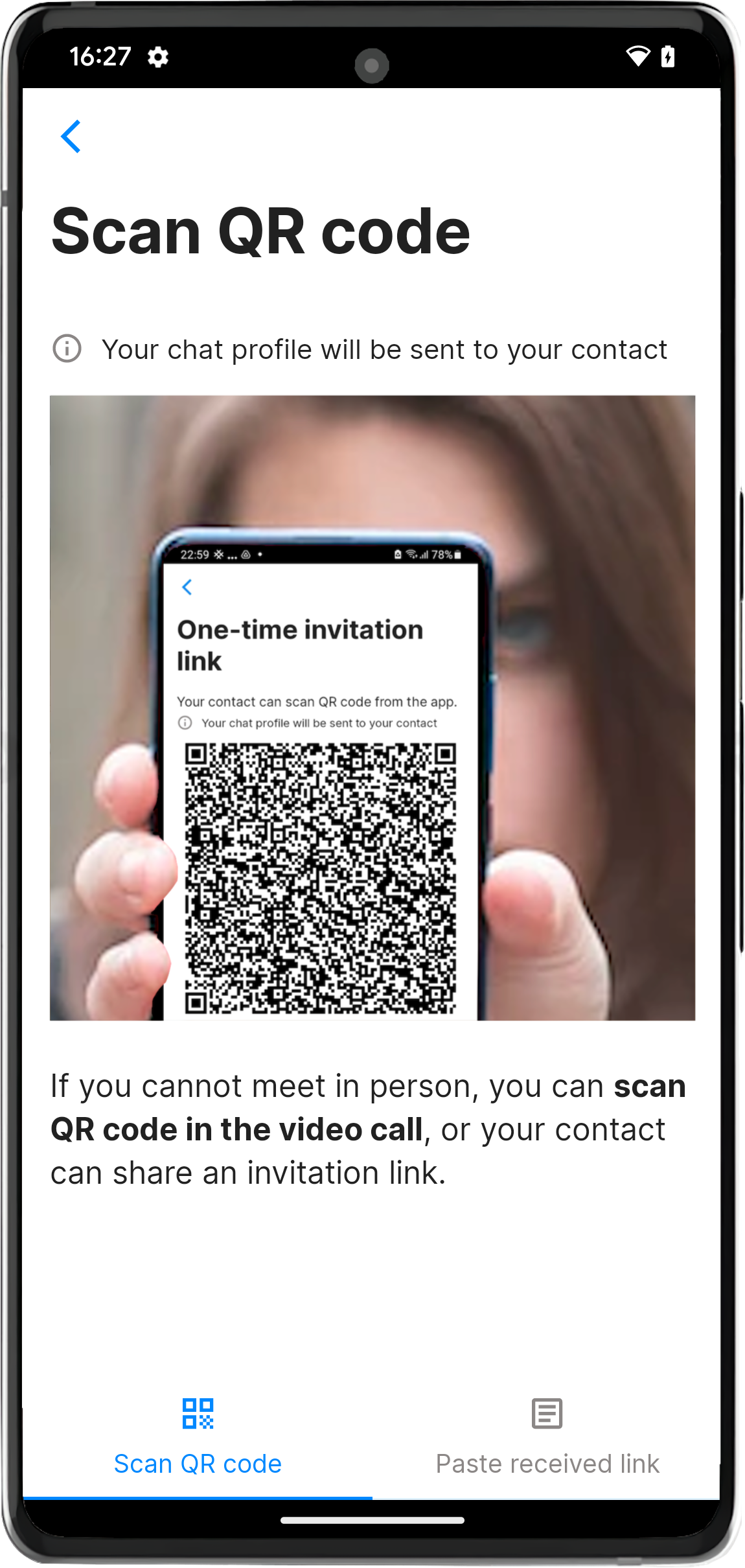

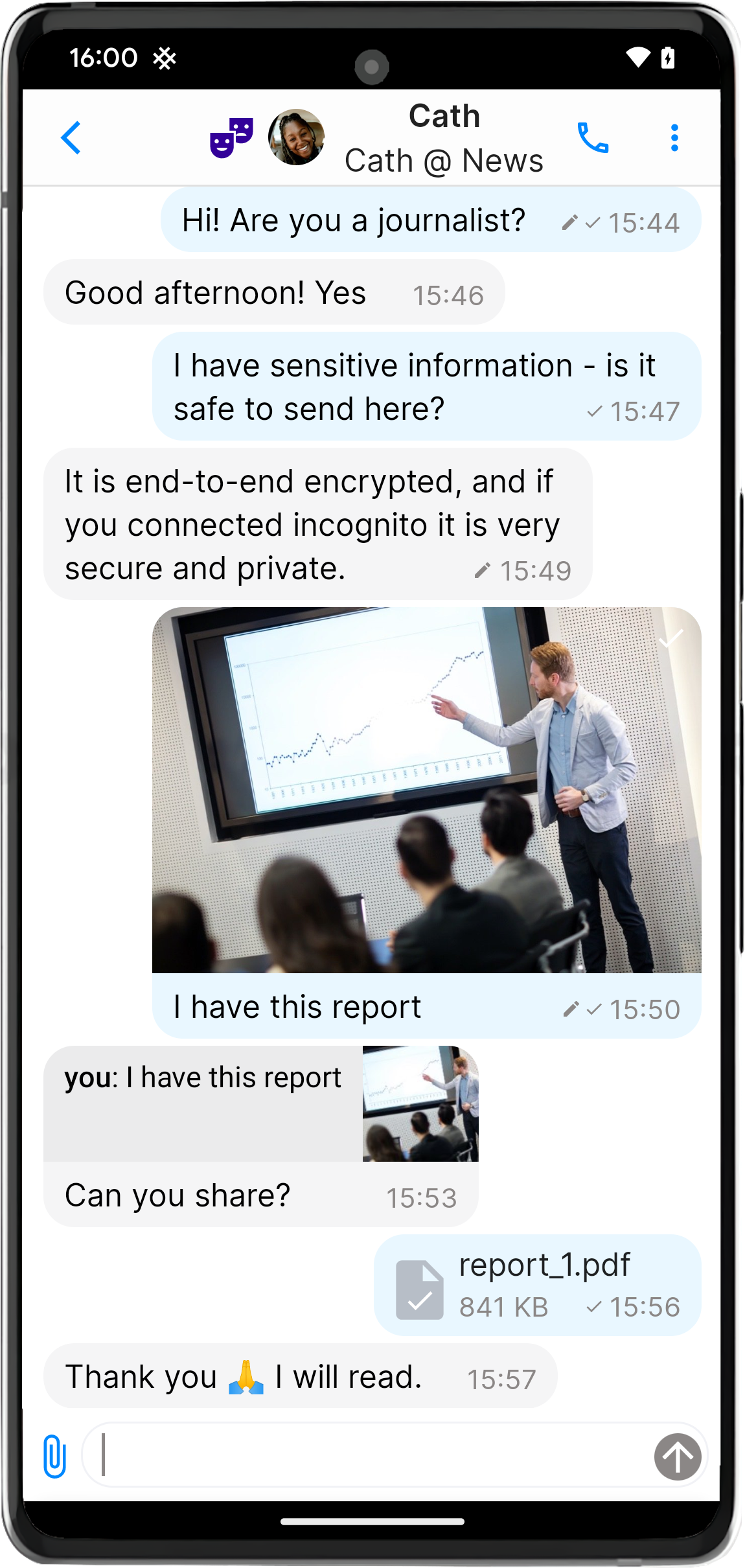
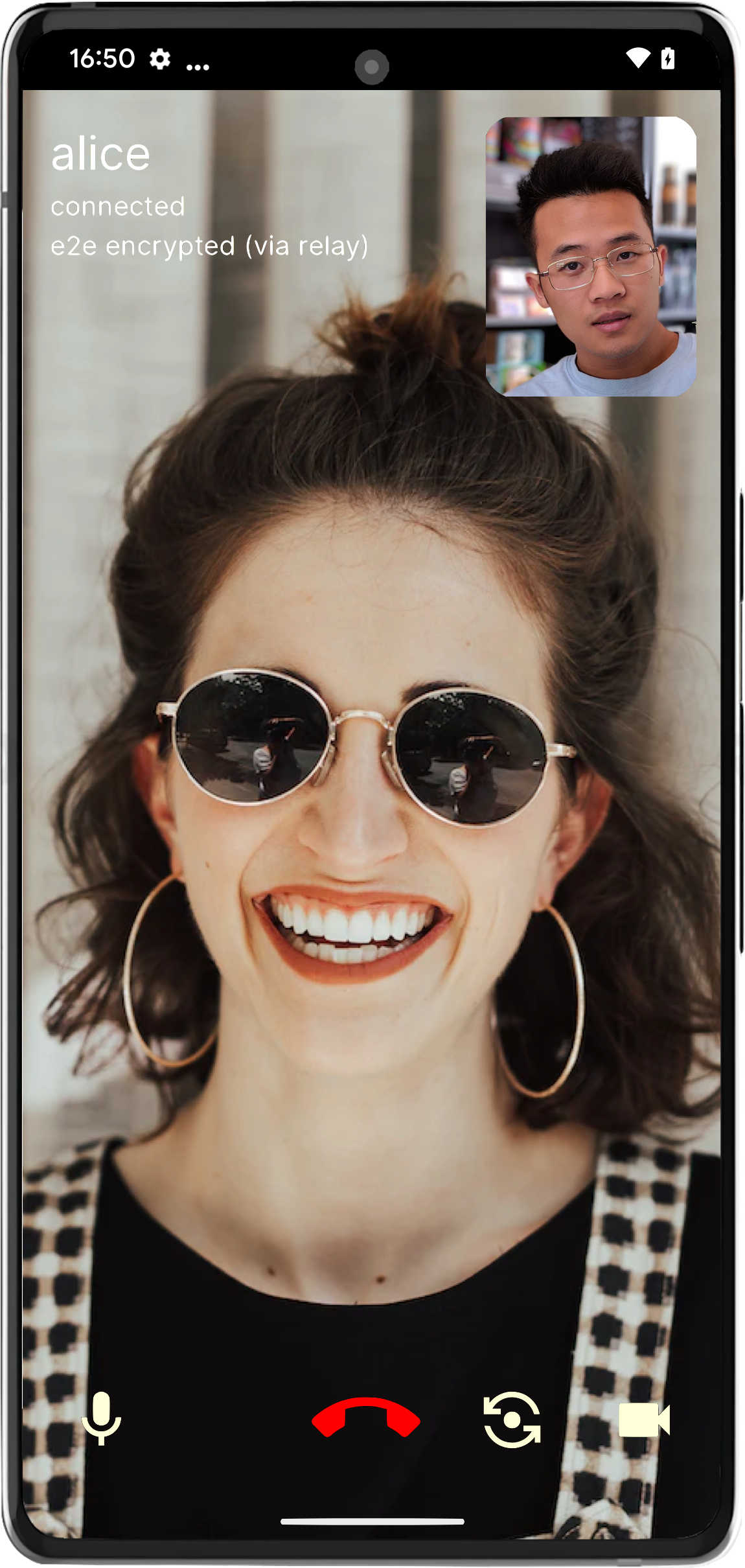
After you connect, you can verify connection security code.
User guide (NEW)
Read about the app features and settings in the new User guide.
Contribute
We would love to have you join the development! You can help us with:
- develop a chat bot for SimpleX Chat!
- writing a tutorial or recipes about hosting servers, chat bots, etc.
- developing features - please connect to us via chat so we can help you get started.
Help translating SimpleX Chat
Thanks to our users and Weblate, SimpleX Chat apps, website and documents are translated to many other languages.
Join our translators to help SimpleX grow!
| locale | language | contributor | Android and iOS | website | Github docs |
|---|---|---|---|---|---|
| 🇬🇧 en | English | ✓ | ✓ | ✓ | |
| ar | العربية | jermanuts |  - |
 |
|
| 🇧🇬 bg | Български |   |
|||
| 🇨🇿 cs | Čeština | zen0bit |   |
 |
✓ |
| 🇩🇪 de | Deutsch | mlanp |   |
 |
|
| 🇪🇸 es | Español | Mateyhv |   |
 |
|
| 🇫🇮 fi | Suomi |   |
 |
||
| 🇫🇷 fr | Français | ishi_sama |   |
 |
✓ |
| 🇮🇱 he | עִברִית |  - |
|||
| 🇭🇺 hu | Magyar |  - |
|||
| 🇮🇹 it | Italiano | unbranched |   |
 |
|
| 🇯🇵 ja | 日本語 |   |
 |
||
| 🇳🇱 nl | Nederlands | mika-nl |   |
 |
|
| 🇵🇱 pl | Polski | BxOxSxS |   |
||
| 🇧🇷 pt-BR | Português |  - |
 |
||
| 🇷🇺 ru | Русский |   |
|||
| 🇹🇭 th | ภาษาไทย | titapa-punpun |   |
||
| 🇹🇷 tr | Türkçe |   |
|||
| 🇺🇦 uk | Українська |   |
 |
||
| 🇨🇳 zh-CHS | 简体中文 | sith-on-mars Float-hu |
  |
 |
Languages in progress: Arabic, Japanese, Korean, Portuguese and others. We will be adding more languages as some of the already added are completed – please suggest new languages, review the translation guide and get in touch with us!
Please support us with your donations
Huge thank you to everybody who donated to SimpleX Chat!
We are prioritizing users privacy and security - it would be impossible without your support.
Our pledge to our users is that SimpleX protocols are and will remain open, and in public domain, - so anybody can build the future implementations of the clients and the servers. We are building SimpleX platform based on the same principles as email and web, but much more private and secure.
Your donations help us raise more funds - any amount, even the price of the cup of coffee, would make a big difference for us.
It is possible to donate via:
- GitHub (commission-free) or OpenCollective (~10% commission).
- BTC: bc1q2gy6f02nn6vvcxs0pnu29tpnpyz0qf66505d4u
- XMR: 8A3ZWAXrrQddvnT1fPrtbK86ZAoM4nai3Gjg1LEow3JWcryJtovMnHYZnxTJpCLmAbfWbnPMeTzPmMBjAhyd4xoM89hYq1c
- BCH: bitcoincash:qq6c8vfvxqrk6rhdysgvkhqc24sggkfsx5nqvdlqcg
- ETH/USDT (Ethereum, Arbitrum One): 0xD7047Fe3Eecb2f2FF78d839dD927Be27Bc12c86a (donate.simplexchat.eth)
- ZEC: t1fwjQW5gpFhDqXNhxqDWyF9j9WeKvVS5Jg
- ZEC shielded: u16rnvkflumf5uw9frngc2lymvmzgdr2mmc9unyu0l44unwfmdcpfm0axujd2w34ct3ye709azxsqge45705lpvvqu264ltzvfay55ygyq
- DOGE: D99pV4n9TrPxBPCkQGx4w4SMSa6QjRBxPf
- SOL: 7JCf5m3TiHmYKZVr6jCu1KeZVtb9Y1jRMQDU69p5ARnu
- please ask if you want to donate any other coins.
Thank you,
Evgeny
SimpleX Chat founder
Contents
- Why privacy matters
- SimpleX approach to privacy and security
- Frequently asked questions
- News and updates
- Quick installation of a terminal app
- SimpleX Platform design
- Privacy and security: technical details and limitations
- For developers
- Develop a chat bot
- Roadmap
- Disclaimers, Security contact, License
Why privacy matters
Everyone should care about privacy and security of their communications - innocuous conversations can put you in danger even if there is nothing to hide.
One of the most shocking stories is the experience of Mohamedou Ould Salahi that he wrote about in his memoir and that is shown in The Mauritanian movie. He was put into Guantanamo camp, without trial, and was tortured there for 15 years after a phone call to his relative in Afghanistan, under suspicion of being involved in 9/11 attacks, even though he lived in Germany for the 10 years prior to the attacks.
It is not enough to use an end-to-end encrypted messenger, we all should use the messengers that protect the privacy of our personal networks - who we are connected with.
SimpleX approach to privacy and security
Complete privacy of your identity, profile, contacts and metadata
Unlike any other existing messaging platform, SimpleX has no identifiers assigned to the users - not even random numbers. This protects the privacy of who are you communicating with, hiding it from SimpleX platform servers and from any observers. Read more.
The best protection against spam and abuse
As you have no identifier on SimpleX platform, you cannot be contacted unless you share a one-time invitation link or an optional temporary user address. Read more.
Complete ownership, control and security of your data
SimpleX stores all user data on client devices, the messages are only held temporarily on SimpleX relay servers until they are received. Read more.
Users own SimpleX network
You can use SimpleX with your own servers and still communicate with people using the servers that are pre-configured in the apps or any other SimpleX servers. Read more.
Frequently asked questions
-
How SimpleX can deliver messages without any user identifiers? See v2 release announcement explaining how SimpleX works.
-
Why should I not just use Signal? Signal is a centralized platform that uses phone numbers to identify its users and their contacts. It means that while the content of your messages on Signal is protected with robust end-to-end encryption, there is a large amount of meta-data visible to Signal - who you talk with and when.
-
How is it different from Matrix, Session, Ricochet, Cwtch, etc., that also don't require user identities? Although these platforms do not require a real identity, they do rely on anonymous user identities to deliver messages – it can be, for example, an identity key or a random number. Using a persistent user identity, even anonymous, creates a risk that user's connection graph becomes known to the observers and/or service providers, and it can lead to de-anonymizing some users. If the same user profile is used to connect to two different people via any messenger other than SimpleX, these two people can confirm if they are connected to the same person - they would use the same user identifier in the messages. With SimpleX there is no meta-data in common between your conversations with different contacts - the quality that no other messaging platform has.
News and updates
Recent and important updates:
Jul 29, 2025 SimpleX Chat v6.4.1: welcome your contacts, review members to protect groups, and more.
Mar 8, 2025. SimpleX Chat v6.3: new user experience and safety in public groups
Jan 14, 2025. SimpleX network: large groups and privacy-preserving content moderation
Mar 14, 2024. SimpleX Chat v5.6 beta: adding quantum resistance to Signal double ratchet algorithm.
Apr 22, 2023. SimpleX Chat: vision and funding, v5.0 released with videos and files up to 1gb.
Nov 8, 2022. Security audit by Trail of Bits, the new website and v4.2 released.
⚡ Quick installation of a terminal app
curl -o- https://raw.githubusercontent.com/simplex-chat/simplex-chat/stable/install.sh | bash
Once the chat client is installed, simply run simplex-chat from your terminal.

Read more about installing and using the terminal app.
SimpleX Platform design
SimpleX is a client-server network with a unique network topology that uses redundant, disposable message relay nodes to asynchronously pass messages via unidirectional (simplex) message queues, providing recipient and sender anonymity.
Unlike P2P networks, all messages are passed through one or several server nodes, that do not even need to have persistence. In fact, the current SMP server implementation uses in-memory message storage, persisting only the queue records. SimpleX provides better metadata protection than P2P designs, as no global participant identifiers are used to deliver messages, and avoids the problems of P2P networks.
Unlike federated networks, the server nodes do not have records of the users, do not communicate with each other and do not store messages after they are delivered to the recipients. There is no way to discover the full list of servers participating in SimpleX network. This design avoids the problem of metadata visibility that all federated networks have and better protects from the network-wide attacks.
Only the client devices have information about users, their contacts and groups.
See SimpleX whitepaper for more information on platform objectives and technical design.
See SimpleX Chat Protocol for the format of messages sent between chat clients over SimpleX Messaging Protocol.
Privacy and security: technical details and limitations
SimpleX Chat is a work in progress – we are releasing improvements as they are ready. You have to decide if the current state is good enough for your usage scenario.
We compiled a glossary of terms used to describe communication systems to help understand some terms below and to help compare advantages and disadvantages of various communication systems.
What is already implemented:
- Instead of user profile identifiers used by all other platforms, even the most private ones, SimpleX uses pairwise per-queue identifiers (2 addresses for each unidirectional message queue, with an optional 3rd address for push notifications on iOS, 2 queues in each connection between the users). It makes observing the network graph on the application level more difficult, as for
nusers there can be up ton * (n-1)message queues. - End-to-end encryption in each message queue using NaCl cryptobox. This is added to allow redundancy in the future (passing each message via several servers), to avoid having the same ciphertext in different queues (that would only be visible to the attacker if TLS is compromised). The encryption keys used for this encryption are not rotated, instead we are planning to rotate the queues. Curve25519 keys are used for key negotiation.
- Double ratchet end-to-end encryption in each conversation between two users (or group members). This is the same algorithm that is used in Signal and many other messaging apps; it provides OTR messaging with forward secrecy (each message is encrypted by its own ephemeral key) and break-in recovery (the keys are frequently re-negotiated as part of the message exchange). Two pairs of Curve448 keys are used for the initial key agreement, initiating party passes these keys via the connection link, accepting side - in the header of the confirmation message.
- Post-quantum resistant key exchange in double ratchet protocol on every ratchet step. Read more in this post and also see this publication by Apple explaining the need for post-quantum key rotation.
- Additional layer of encryption using NaCL cryptobox for the messages delivered from the server to the recipient. This layer avoids having any ciphertext in common between sent and received traffic of the server inside TLS (and there are no identifiers in common as well).
- Several levels of content padding to frustrate message size attacks.
- All message metadata, including the time when the message was received by the server (rounded to a second) is sent to the recipients inside an encrypted envelope, so even if TLS is compromised it cannot be observed.
- Only TLS 1.2/1.3 are allowed for client-server connections, limited to cryptographic algorithms: CHACHA20POLY1305_SHA256, Ed25519/Ed448, Curve25519/Curve448.
- To protect against replay attacks SimpleX servers require tlsunique channel binding as session ID in each client command signed with per-queue ephemeral key.
- To protect your IP address from unknown messaging relays, and for per-message transport anonymity (compared with Tor/VPN per-connection anonymity), from v6.0 all SimpleX Chat clients use private message routing by default. Read more in this post.
- To protect your IP address from unknown file relays, when SOCKS proxy is not enabled SimpleX Chat clients ask for a confirmation before downloading the files from unknown servers.
- To protect your IP address from known servers all SimpleX Chat clients support accessing messaging servers via Tor - see v3.1 release announcement for more details.
- Local database encryption with passphrase - your contacts, groups and all sent and received messages are stored encrypted. If you used SimpleX Chat before v4.0 you need to enable the encryption via the app settings.
- Transport isolation - different TCP connections and Tor circuits are used for traffic of different user profiles, optionally - for different contacts and group member connections.
- Manual messaging queue rotations to move conversation to another SMP relay.
- Sending end-to-end encrypted files using XFTP protocol.
- Local files encryption.
- Reproducible server builds.
We plan to add:
- Automatic message queue rotation and redundancy. Currently the queues created between two users are used until the queue is manually changed by the user or contact is deleted. We are planning to add automatic queue rotation to make these identifiers temporary and rotate based on some schedule TBC (e.g., every X messages, or every X hours/days).
- Message "mixing" - adding latency to message delivery, to protect against traffic correlation by message time.
- Reproducible clients builds – this is a complex problem, but we are aiming to have it in 2025 at least partially.
- Recipients' XFTP relays to reduce traffic and conceal IP addresses from the relays chosen, and potentially controlled, by another party.
For developers
You can:
- create chat bots and services.
- run simplex-chat terminal CLI to execute individual chat commands, e.g. to send messages as part of shell script execution.
- use SimpleX Chat library to integrate chat functionality into your mobile apps.
- create chat bots and services in Haskell - see simple and more advanced chat bot example.
If you are considering developing with SimpleX platform please get in touch for any advice and support.
Please also join #simplex-devs group to ask any questions and share your success stories.
Develop a chat bot
You can create a chat bot or any chat-based service in any language running SimpleX Chat terminal CLI as a local WebSocket server.
See our new bot API reference. Most of it is automatically generated from core library types, so it stays up to date.
Also see TypeScript SimpleX Chat client and JavaScript chat bot example.
Roadmap
- ✅ Easy to deploy SimpleX server with in-memory message storage, without any dependencies.
- ✅ Terminal (console) client with groups and files support.
- ✅ One-click SimpleX server deployment on Linode.
- ✅ End-to-end encryption using double-ratchet protocol with additional encryption layer.
- ✅ Mobile apps v1 for Android and iOS.
- ✅ Private instant notifications for Android using background service.
- ✅ Haskell chat bot templates.
- ✅ v2.0 - supporting images and files in mobile apps.
- ✅ Manual chat history deletion.
- ✅ End-to-end encrypted WebRTC audio and video calls via the mobile apps.
- ✅ Privacy preserving instant notifications for iOS using Apple Push Notification service.
- ✅ Chat database export and import.
- ✅ Chat groups in mobile apps.
- ✅ Connecting to messaging servers via Tor.
- ✅ Dual server addresses to access messaging servers as v3 hidden services.
- ✅ Chat server and TypeScript client SDK to develop chat interfaces, integrations and chat bots (ready for announcement).
- ✅ Incognito mode to share a new random name with each contact.
- ✅ Chat database encryption.
- ✅ Automatic chat history deletion.
- ✅ Links to join groups and improve groups stability.
- ✅ Voice messages (with recipient opt-out per contact).
- ✅ Basic authentication for SMP servers (to authorize creating new queues).
- ✅ View deleted messages, full message deletion by sender (with recipient opt-in per contact).
- ✅ Block screenshots and view in recent apps.
- ✅ Advanced server configuration.
- ✅ Disappearing messages (with recipient opt-in per-contact).
- ✅ "Live" messages.
- ✅ Contact verification via a separate out-of-band channel.
- ✅ Multiple user profiles in the same chat database.
- ✅ Optionally avoid re-using the same TCP session for multiple connections.
- ✅ Preserve message drafts.
- ✅ File server to optimize for efficient and private sending of large files.
- ✅ Improved audio & video calls.
- ✅ Support older Android OS and 32-bit CPUs.
- ✅ Hidden chat profiles.
- ✅ Sending and receiving large files via XFTP protocol.
- ✅ Video messages.
- ✅ App access passcode.
- ✅ Improved Android app UI design.
- ✅ Optional alternative access password.
- ✅ Message reactions
- ✅ Message editing history
- ✅ Reduced battery and traffic usage in large groups.
- ✅ Message delivery confirmation (with sender opt-out per contact).
- ✅ Desktop client.
- ✅ Encryption of local files stored in the app.
- ✅ Using mobile profiles from the desktop app.
- ✅ Private notes.
- ✅ Improve sending videos (including encryption of locally stored videos).
- ✅ Post-quantum resistant key exchange in double ratchet protocol.
- ✅ Message delivery relay for senders (to conceal IP address from the recipients' servers and to reduce the traffic).
- ✅ Support multiple network operators in the app.
- 🏗 Large groups, communities and public channels.
- 🏗 Short links to connect and join groups.
- 🏗 Improve stability and reduce battery usage.
- 🏗 Improve experience for the new users.
- Privacy & security slider - a simple way to set all settings at once.
- SMP queue redundancy and rotation (manual is supported).
- Include optional message into connection request sent via contact address.
- Improved navigation and search in the conversation (expand and scroll to quoted message, scroll to search results, etc.).
- Feeds/broadcasts.
- Ephemeral/disappearing/OTR conversations with the existing contacts.
- Privately share your location.
- Web widgets for custom interactivity in the chats.
- Programmable chat automations / rules (automatic replies/forward/deletion/sending, reminders, etc.).
- Privacy-preserving identity server for optional DNS-based contact/group addresses to simplify connection and discovery, but not used to deliver messages:
- keep all your contacts and groups even if you lose the domain.
- the server doesn't have information about your contacts and groups.
- High capacity multi-node SMP relays.
Disclaimers
SimpleX protocols and security model was reviewed, and had many breaking changes and improvements in v1.0.0.
The implementation security assessment of SimpleX cryptography and networking was done in October 2022 by Trail of Bits – see the announcement.
The cryptographic review of SimpleX protocols was done in July 2024 by Trail of Bits – see the announcement.
SimpleX Chat is still a relatively early stage platform (the mobile apps were released in March 2022), so you may discover some bugs and missing features. We would really appreciate if you let us know anything that needs to be fixed or improved.
The default servers configured in the app are provided on the best effort basis. We are currently not guaranteeing any SLAs, although historically our servers had over 99.9% uptime each.
We have never provided or have been requested access to our servers or any information from our servers by any third parties. If we are ever requested to provide such access or information, we will be following due legal process.
We do not log IP addresses of the users and we do not perform any traffic correlation on our servers. If transport level security is critical you must use Tor or some other similar network to access messaging servers. We will be improving the client applications to reduce the opportunities for traffic correlation.
Please read more in Privacy Policy.
Security contact
Please see our Security Policy on how to report security vulnerabilities to us. We will coordinate the fix and disclosure.
Please do NOT report security vulnerabilities via GitHub issues.
License
This software is licensed under the GNU Affero General Public License version 3 (AGPLv3). See the LICENSE file for details. The SimpleX and SimpleX Chat name, logo, associated branding materials, and application and website graphic assets (illustrations, images, visual designs, etc.) are not covered by this license and are subject to the terms outlined in the TRADEMARK and ASSETS_LICENSE files respectively.
If you want to use any graphic assets in your publications, please ask for permission. Texts can be used as direct quotes, referencing the source.